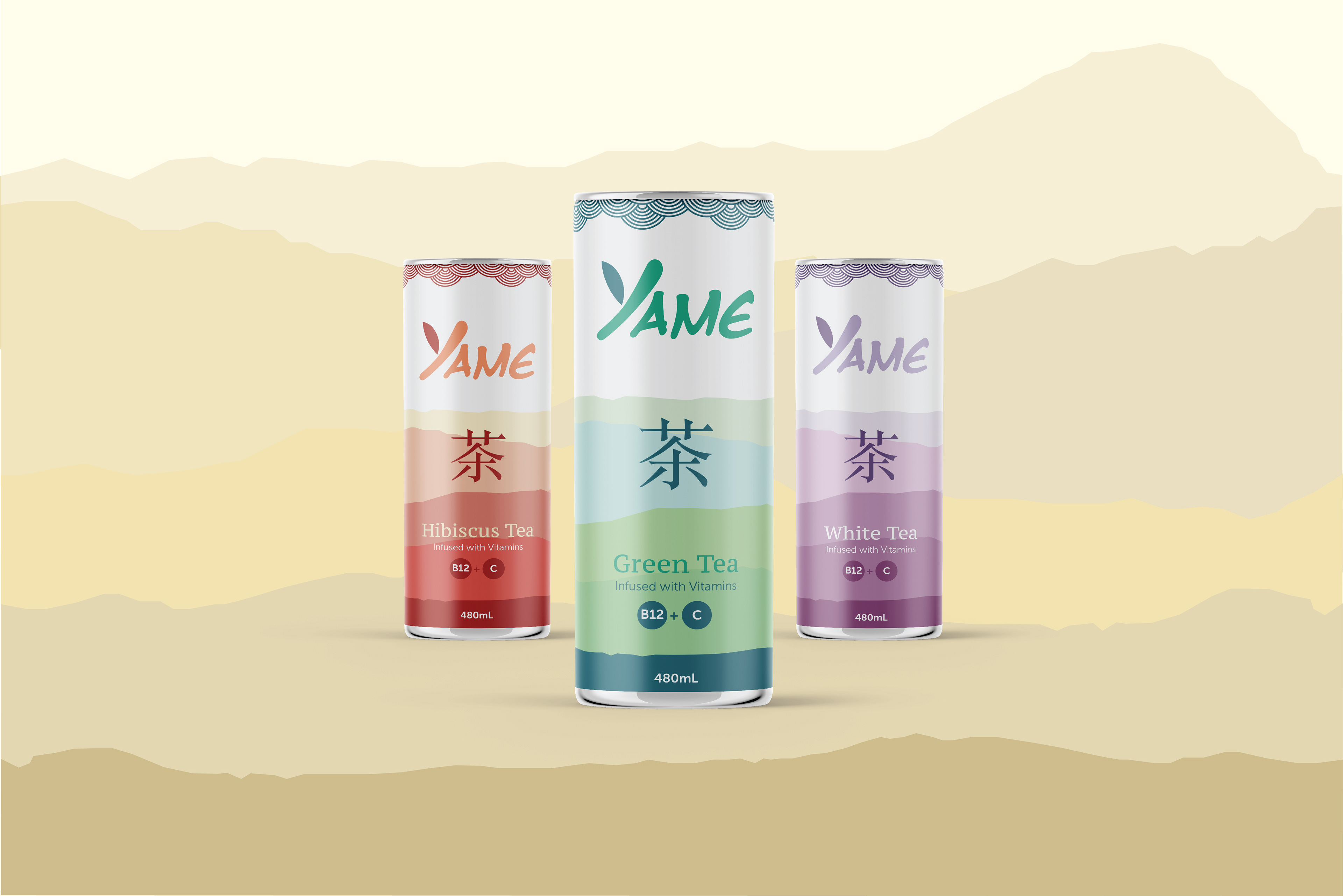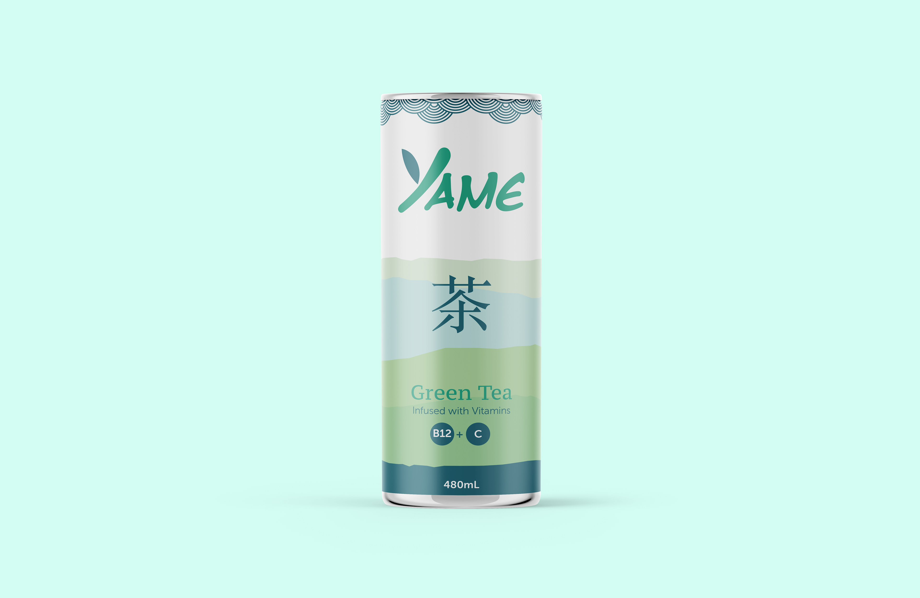
This package design was inspired by my obsession of green tea. When coming up with the name I researched Japanese locations that grow tea leaves and one of the places is called Yame. I stumbled across this font and thought that the Y in Yame looked like a branch. So, after messing around with it I put a leaf on Y and turned it into a bamboo shoot. I created a circular pattern for the rim of the tea can. The background I used an image of Japanese hills as inspiration and created different shades of colors based on the flavor of the tea.